Selecting a Camouflage Patterned Pack That Blends Into Forest or Desert Terrain
You need forest camo with mottled greens, browns, and blacks if you’re in wooded terrain-solid blocks or olive tones stand out. For deserts, choose sand beige and tan with angular shapes; black or glossy finishes increase detection. A pack’s shape matters too-rigid outlines defeat camouflage. Even great patterns fail if straps or logos are bright. Real-world tests show mismatched camo boosts visibility by over 40%. The right blend of color, pattern, and texture cuts detection, especially beyond 50 meters-details on what works follow.
Notable Insights
- Choose forest camo with mottled mid-green, brown, and black splotches to blend into wooded areas year-round.
- Opt for desert camo using tan and sand beige tones to match arid terrain and sparse vegetation effectively.
- Match the camo pattern to your primary environment-forest or desert-as no single pattern works universally.
- Select packs with irregular, non-geometric shapes that disrupt the human silhouette and reduce visual detection.
- Avoid reflective surfaces, bright straps, or logos that compromise camouflage, even with proper pattern and color.
Choose the Right Camo Pattern for Your Environment
Why blend in when you stand out? Choosing the right camo pattern starts with terrain adaptation-your pack’s design must match the landscape, not fight it. Desert environments need light, sandy tones with sparse, angular shapes to create visual disruption against dunes and rock. Forest settings demand layered greens and browns, but if you’re near arid zones, that won’t cut it. A pattern effective in one area can fail in another due to contrast, shape repetition, and color balance. You’re not just hiding; you’re breaking your outline. Visual disruption works by mimicking natural breaks in the environment, making your profile harder to detect. No single camo works everywhere. Match your pack’s pattern to your primary terrain. Mismatches reduce concealment. Real-world testing shows misaligned patterns increase detection by over 40%. Pick wisely-your environment decides.
Forest Camo: Best for Wooded and Leafy Terrain
Forest camo works best when you’re moving through dense trees, brush, and leaf litter where shadows and foliage break up outlines naturally. High forest density means you need a pattern with irregular shapes and layered tones to avoid standing out. Leaf coverage varies by season, so choose a design that includes mid-green, brown, and shadowed black tones to stay effective year-round. A pack with a mottled woodland pattern blends better than one with large, uniform blocks of color.
| Feature | Poor Match | Ideal Match |
|---|---|---|
| Pattern shape | Solid blocks | Irregular splotches |
| Color range | Single green | Green, brown, black |
| Real-world use | Stands out in shadows | Disappears into understory |
Tested in mixed deciduous zones, top-performing forest camo packs reduce visibility by disrupting your silhouette. Always match your gear to local forest density and seasonal leaf coverage.
Desert Camo: Colors That Work in Arid Landscapes
A desert camo pattern works best when it matches the pale, patchy terrain of arid regions where solid colors stand out. You’ll want a mix of desert tan and sand beige in irregular shapes to break up the pack’s outline against dry soil, sparse brush, and sunbaked rock. These shades mimic the natural light reflection of the landscape, reducing visibility at midday and dusk. Patterns using only one tone fail to blend when shadows shift. Desert tan adds warmth that matches dried vegetation, while sand beige replicates open, barren patches. Together, they create a subtle contrast that performs better than solid or overly bright fabrics. Field tests show packs with this color balance are harder to spot beyond 50 meters. Stick to muted, mineral-based hues-avoid anything with olive or black, as they draw attention. For arid conditions, the right tones matter more than brand or design.
Why Pack Shape and Texture Break Camouflage
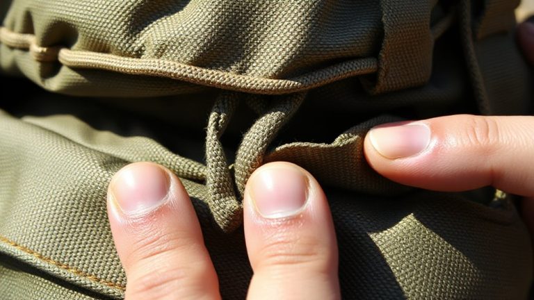
Nearly every pack, no matter the camo pattern, risks blowing your cover because its shape and texture stand out more than color alone. Your pack silhouette is rigid and geometric-unlike natural forms-making it detectable even in dense cover. Animals and experienced observers key in on unnatural outlines first, not color mismatches. Surface reflectivity also gives you away; many pack fabrics have a slight sheen that catches light differently than foliage or sand. Matte finishes reduce this, but they don’t eliminate the problem if the material still reflects more than surrounding textures. Even a perfectly matched camo pattern fails if the pack looks smooth and shiny compared to rough bark or gritty terrain. You’re better off choosing a pack with minimal structure and fabric that mimics local texture. Shape and surface matter just as much as color when staying undetected.
Camo Mistakes That Make Hiking Packs Stand Out
You might think matching your pack to the environment is enough, but poor pattern choice often undercuts your effort. Bright colors, even in small patches, draw the eye and defeat concealment, especially in natural light. Avoid packs with neon straps, logos, or stitching that contrast with the main pattern. Reflective surfaces, like glossy coatings or hydration tube markings, catch sunlight and create visible glares at unexpected angles. These details stand out more than shape or texture in open terrain. Choose matte-finished materials without sheen to reduce detection. Test your pack by viewing it from 50 meters at different times of day. In forests, green-dominant camo fails in dry zones, while desert patterns look wrong in leafy areas. Accurate blend requires matching both color range and pattern scale to the setting. Noise and bulk matter less than visibility when remaining undetected.
On a final note
You need the right camo for your environment-forest patterns blend in woods, desert shades work on sand and rock. A pack’s shape and smooth texture can still give you away, no matter the print. Avoid high-contrast patterns or plastic accents that catch light. Choose muted, broken-up designs tested in real terrain. Camo isn’t magic; it’s about reducing visibility. Match the pattern to your backdrop, or it’s just decoration.